

 2:33 PM
 Design or DYE

Our group assignment was to go home and sketch ideas for the size, shape, and contents of our space. My individual ideas were as follows...
 |
| I began thinking about how we could display the magazine. Here I thought of a wall with large letter bookcases that would spell Vogue and hold the magazines inside. This would be a display unit and an art installation similar to the shelf below |
 |
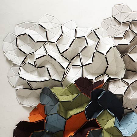
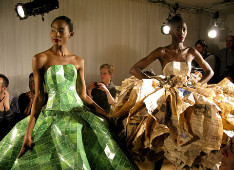
| These 2 sketches are 2 different ideas. The top incorporates 3D panels by French designers Ronan and Erwan Bouroulle . It would be a piece that starts on the ceiling and flows to one of the walls in the space. There would be clear pockets that would hold the magazines in them. Below is a photo of the 3D panels. The 2nd sketch is of a space made entirely of recycled magazine paper. I started on this whole idea of things made out of paper and ran with it. Below is also an item made of recycled paper that fueled my inspiration. |


 |
| Since Vogue is a magazine about fashion I thought the store made out of paper would be a cool play on both and it would display fashion items (such as the dresses) made out of recycled paper. |
 |
| In this sketch I started drafting mini plans of what the space would look like. This started after our group met and decided we wanted to go with the idea of Exposure in the form of a modern day Peep Show. Customers would be able to view the magazines in an ultra modern touch screen booth and they would be able to purchase the magazine at a fully automated kiosk similar to movies you rent from Redbox kiosks. So thinking about the space and incorporating some form of seating and an area to semi-privately view the magazine. |
 |
| Here I sketched some ideas for the layout and for the look of the kiosk. |

 |
| Here my group started to think about how people in the airport would interact with the space. We knew we wanted it to be in an airport corridor so we were concerned about interrupting flow in the airport. We wanted something that people could interact from the outside and also choose to come inside and interact with. |
 |
| The more we sketched the space the more and more we became restricted by the limited amount of space. Our idea was to create an experience when people enter our space. We wanted digital images of the magazine to stream along the outside of our space that way it would draw consumers inside to view the magazine and discover their guilty pleasures. The ideas we were coming up with for a 10x10 space were just too small to create this effect or were getting interrupted by angles. Then we started thinking what if we took up a whole corridor that way the effect would be expansive. |
 |
| I started to draft the elevation of our space. It would be a hallway within a hallway. Vogue would take up one section of a massively long corridor and everyone would be forced to walk through the entire space. The images would stream along the left wall down the 43 feet of space we would occupy. The right side would contain the booths to view the magazine and the kiosks to purchase it at. This space would still be 100 sq feet (like the original 10x10 parameters) . |
 |
| Here is an elevation of the booth area. So our next assignment was to start constructing a model so we would know how all of our ideas were coming together. |
0 comments:
Post a Comment